 This is a project-summary from Melanie Fraiss, Sofiya Iliycheva, Mattia Rainoldi and Roman Egger
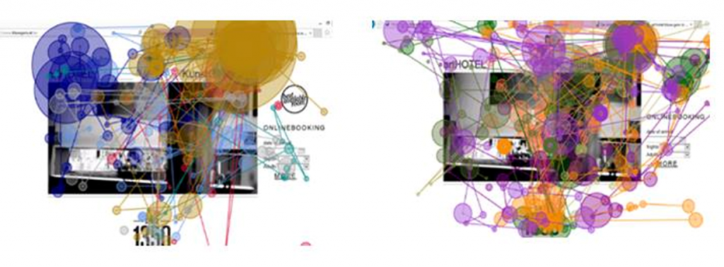
The growing popularity of mobile devices and their extended usage for travel and accommodation booking, have affected both the behavior of consumer and the development of the Tourism and Hospitality Industry (Buhalis & Law, 2008; Egger & Buhalis, 2008; Neuhofer, Buhalis & Ladkin, 2012). During their analysis in 2015, eMarketer predicted that by 2016 that 51.8% of all travel online bookings will come from mobile devices, such as smartphones and tablets (eMarketer, 2015). All this together possesses a big challenge for the developers of hotel mobile websites. Using responsive website design (RWD) to tailor the content of hotel websites to devices with different screen sizes might not be enough. Due to the fact that little attention has been given to the importance of hotel mobile websites, the aim of this paper is to explore the differences of usability and content of hotel mobile websites in the context of devices with different screen sizes. By means of a true experiment involving an eye-tracking study, think aloud protocols and semi-structured interviews, the findings of this research show that while hotel websites used RWD to ensure a uniform visual appearance on both smartphones and tablets, some major differences still emerged in terms of content importance and usability. It is recommended that in order to ensure customer satisfaction, hotel mobile websites should be designed separately for different mobile devices.